
Naturally Amazing
After a hugely successful appearance on ABC’s Shark Tank, Better Life sales exploded and big-box retailers came calling. To evolve to meet the needs of a more mainstream audience, Better Life hired Atomicdust to bring focus to their identity and packaging. We advanced the brand story by spotlighting the products’ remarkable power – an unexpected feature in the natural cleaning category.

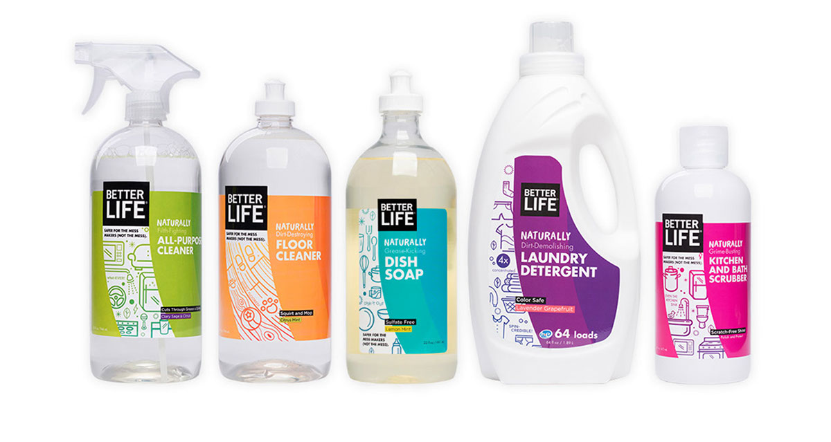
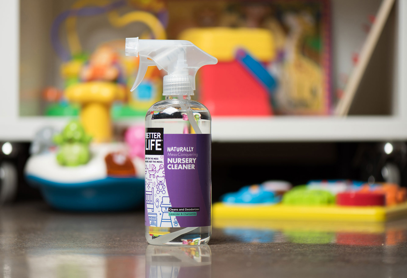
Irresistible on the Shelf
The new Better Life packaging is more consistent, easier to read and, of course, fun. On every bottle, a swoosh cuts through vibrant colors to reinforce the power of the products to cut through grease, grime and dirt. The design revamp has created more consistency across the entire line, helping people recognize the full family of Better Life products, and how well they all work together.


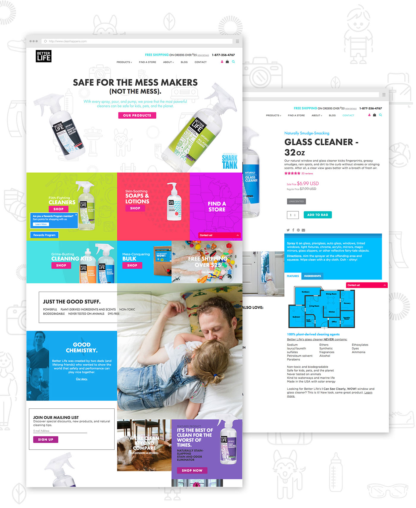
On the Web
A fresh new website celebrates the color and spirit of the packaging while placing the products’ effectiveness front and center. Better Life now stands out from the natural cleaning crowd with its bright and irreverent
web presence.
Packaging Awards and Press
Graphic Design USA honored the labels with a Health + Wellness Design Award and an American Package Design Award. The full line was also featured on The Dieline, and recognized by the American Advertising Awards.


